2020
Adobe XD, Figma
UX/UI Design / Web Design
UX/UI Designer

I redesigned the product interface for The Source and developed a design system that would be adaptable, expandable and flexible as the platform grows and evolves.
A visual identity, marketing website, and web design had already been created before I began this project. These elements served as jumping off points for the development of the design system.
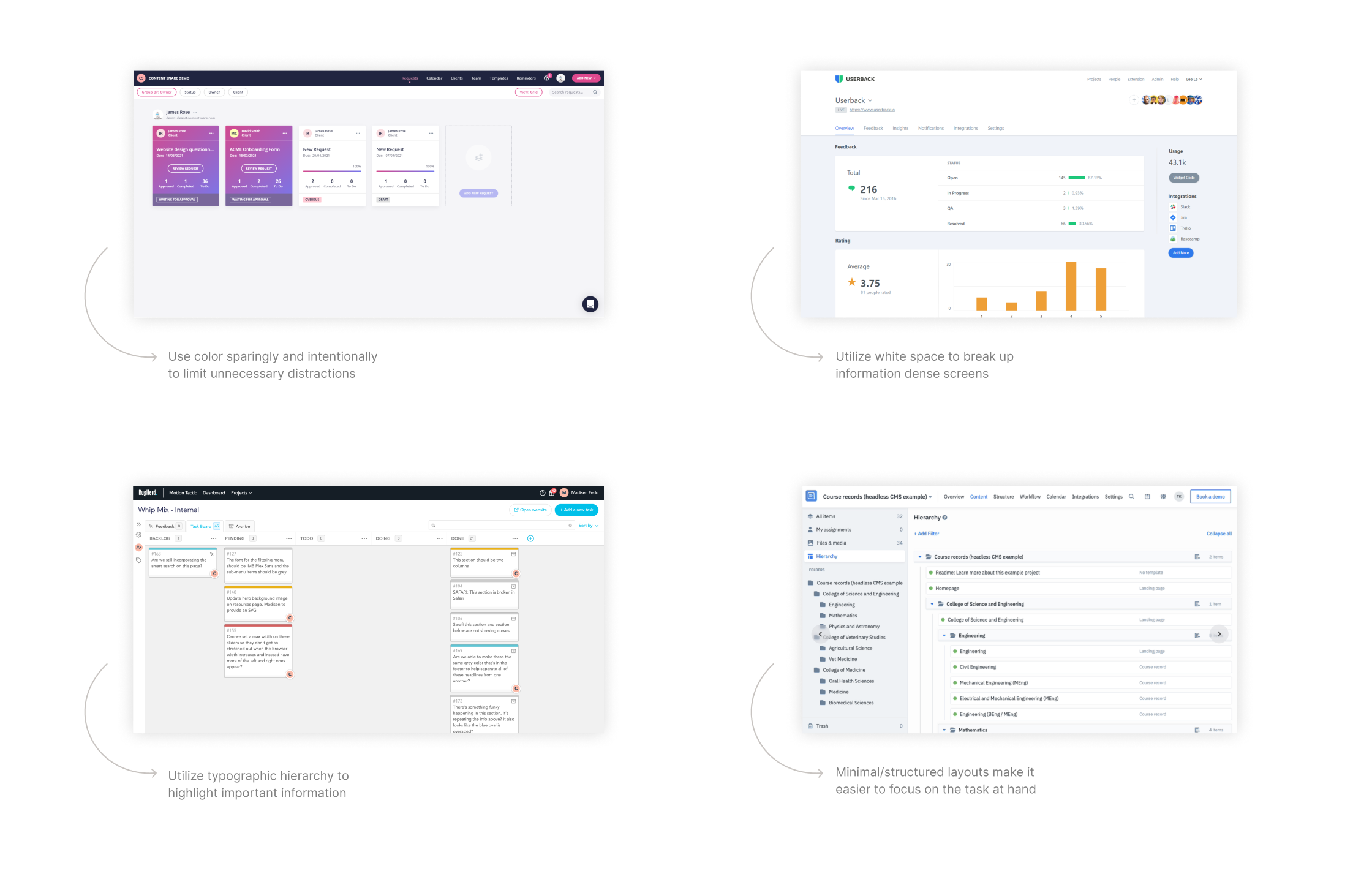
The first step I took was to conduct a visual study of the Source's competitors to identify industry trends on how color, typography and layout impacts complex UI systems.
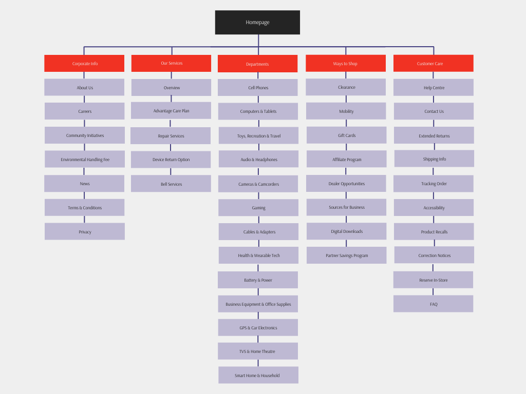
The IA and user flows were established before I started this project but had not been formally documented. I built a site map to help inform my decision making when designing each dashboard.
With a clear scope of the competitive landscape, I developed a design system that was visually calming and easy to use though the following practices:
01
Minimal, purposeful use of color
02
Typographic hierarchy and contrast make important information stand out
03
Similar component layouts that repeat throughout the dashboards
Roboto was chosen for its classic, neutral, Helvetica-like qualities and it's legibility at small scales.

Using the red identity of the logo for the Source as a starting point, I expanded the color palette to create a more consistent and readable interface.


The final design aims to reduce the visual clutter typically experienced when using the original site to shop for products or view services. By consolidating these tasks into one consistent minimal platform, viewing products/services is easier, workflows are more efficient, and products are more organized for users.
Centralized hub to view all products and services offered in a more minimal and clean interface.
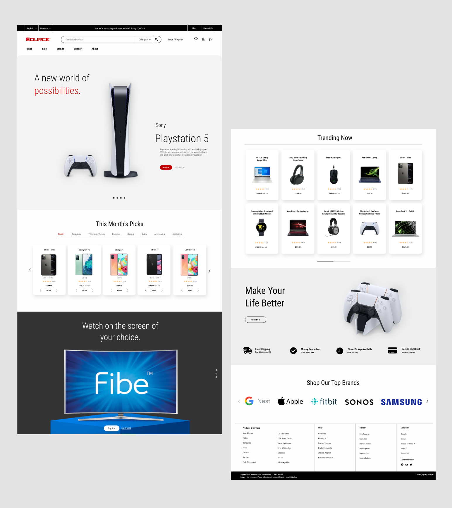
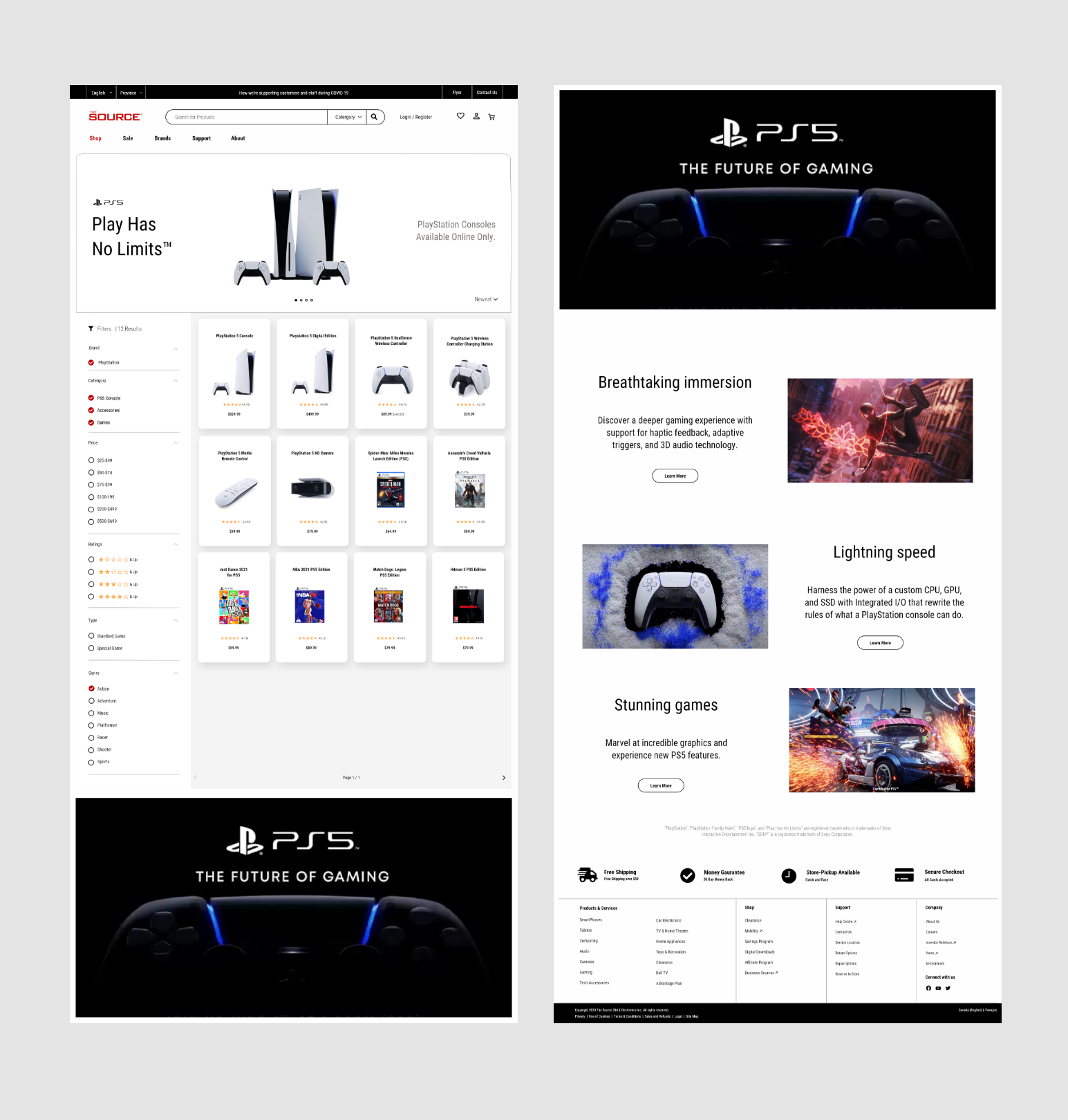
Displays all products with filters and sorting to accommodate users preferences.
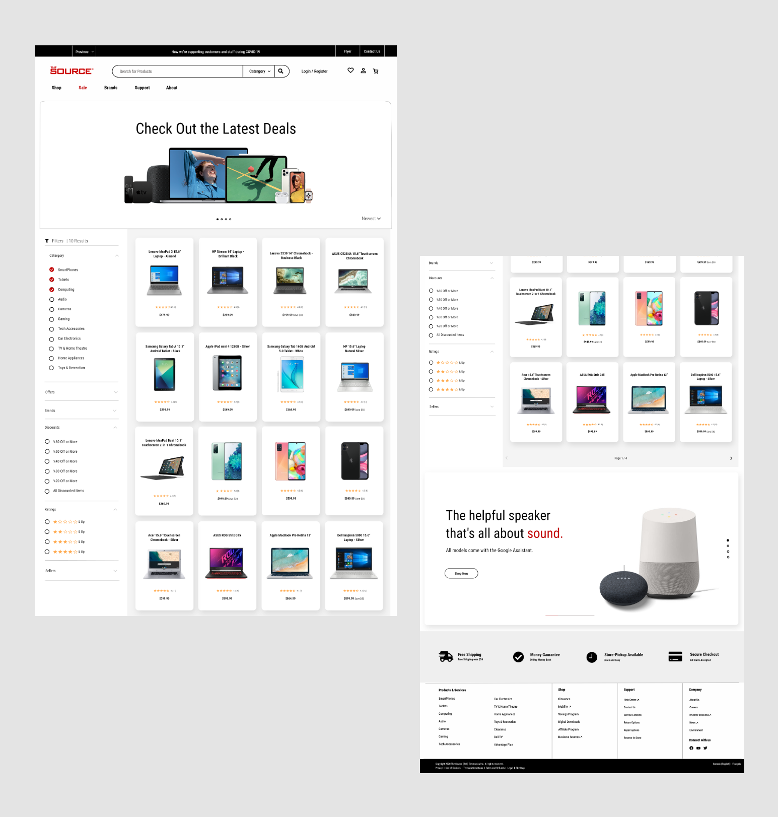
Along with the shopping section, the sales section features filters to display products relevant to the users.
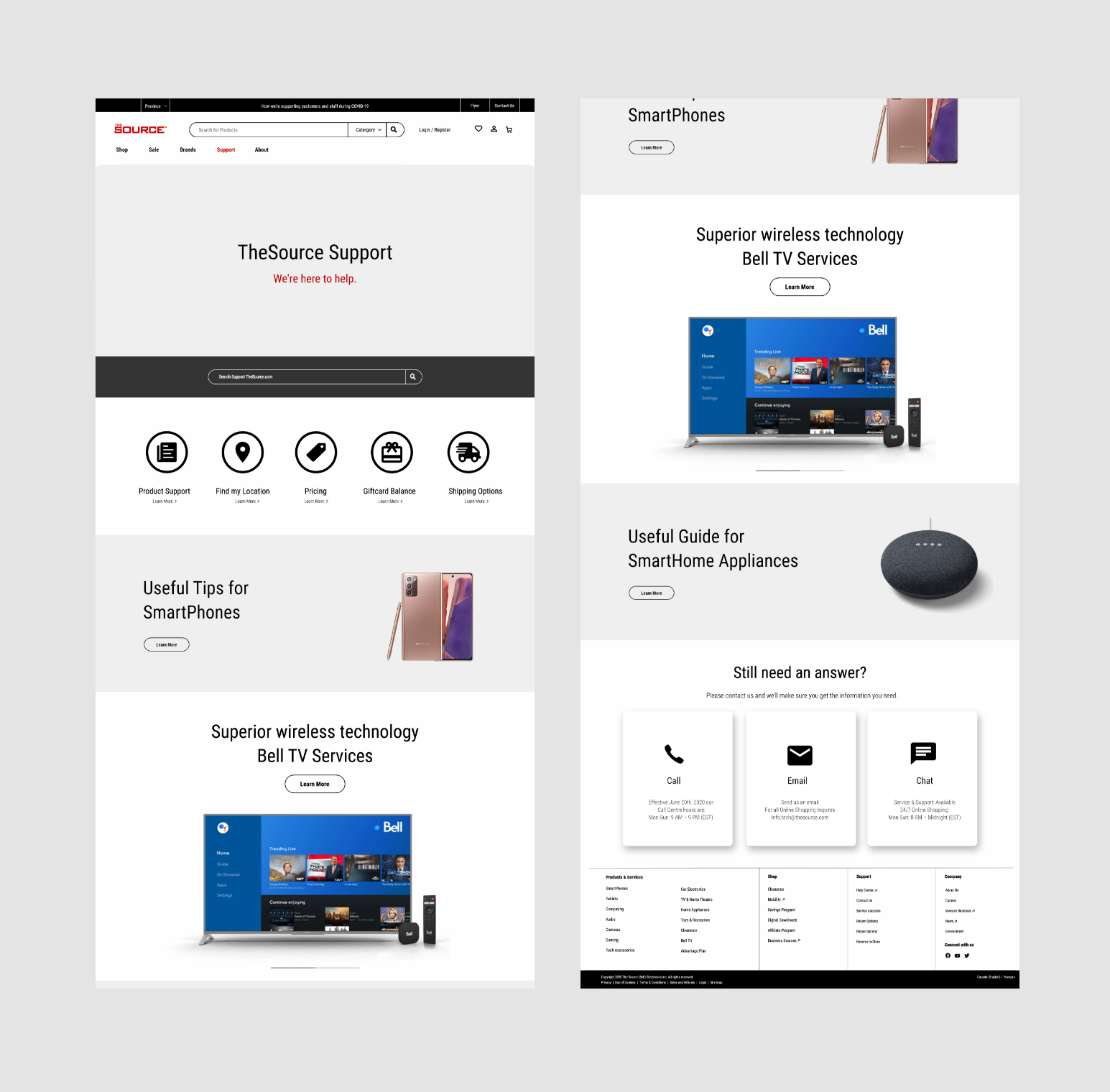
A support page created to organize all services and optimize support by implementing a search bar and options for users.