2021
Illustrator / Photoshop / InDesign
Branding / Identity / UX collaboration
Graphic Designer
The goal of this project was to design a simple yet bold visual identity that presents the uniqueness of my client's work. After conducting an interview with her, I was able to take her design preferences into consideration before the development of the design.
The first step I took was creating a visual mood board of digital elements of various images, colour palettes and textures to visualize possible logo concepts.
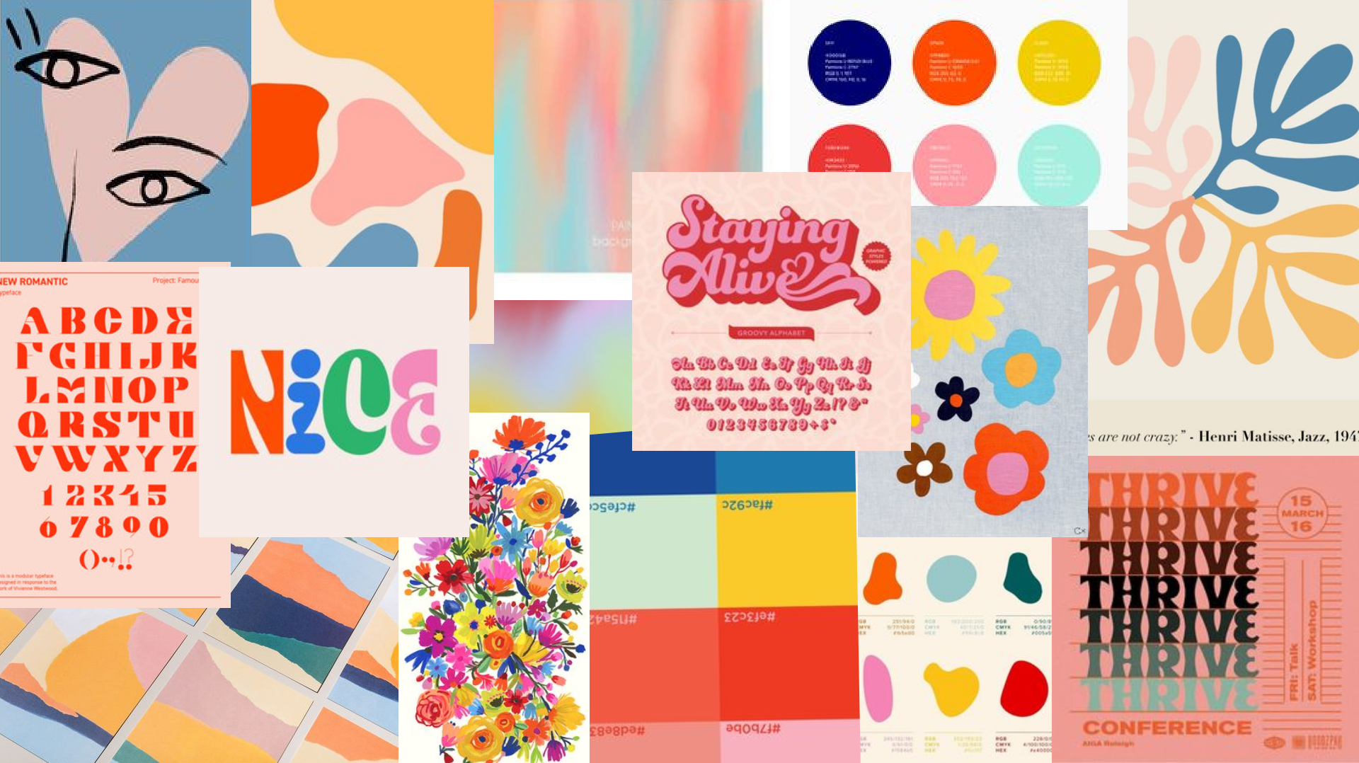
With a clear scope of the primary research, I created a logo design that was visually colorful and though the following practices:
01
Bold color choices
02
Irregular elements inspired by the works of Matisse
03
Contrasting typography
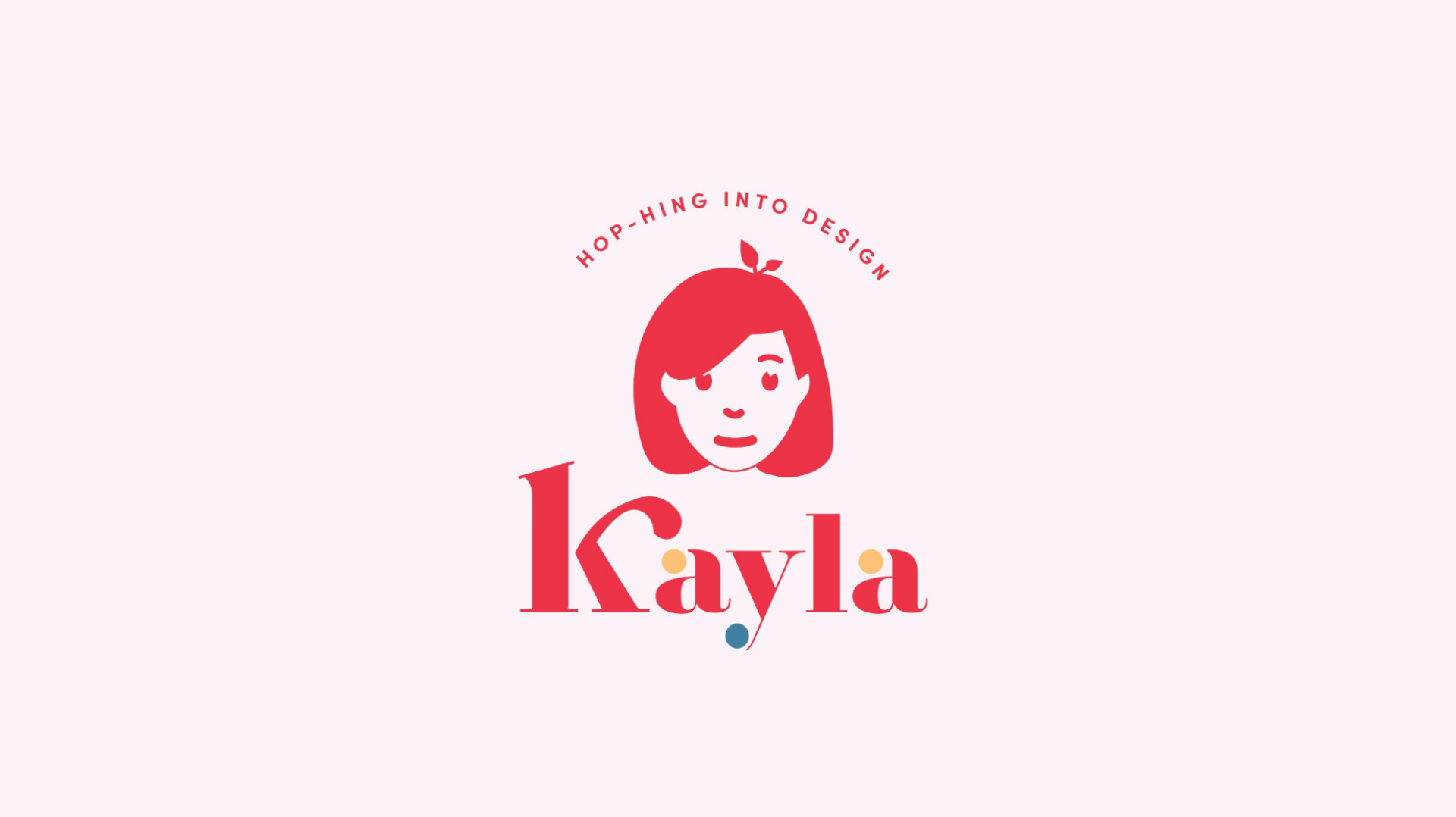
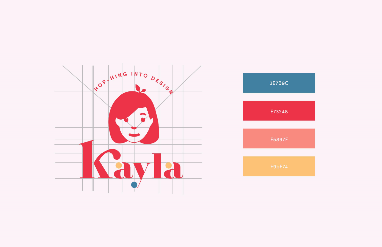
Utopia was chosen for its unique, bold, Baskerville-like qualities and it's contrast at small scales.

I used bold contrasting colors inspired by my client's favourite artist, Matisse. This created a colorful palette which matched the client's color preferences.


I created a simple illustration of her face with a leaf to depict her continuous self-growth in the design field. The illustration has a feminine touch while the colour choices are inspired by the works of Matisse. The entire verbal identity of the logo is simple yet unique through the use of small and irregular shapes and a fun wordplay on her last name, “hop-hing into design!”
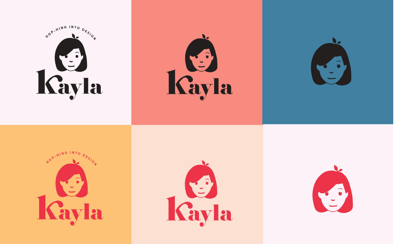
A layout of logo, typographic placement and visual elements presented below.
Other variations in black and coloured form of the final logo are presented below.
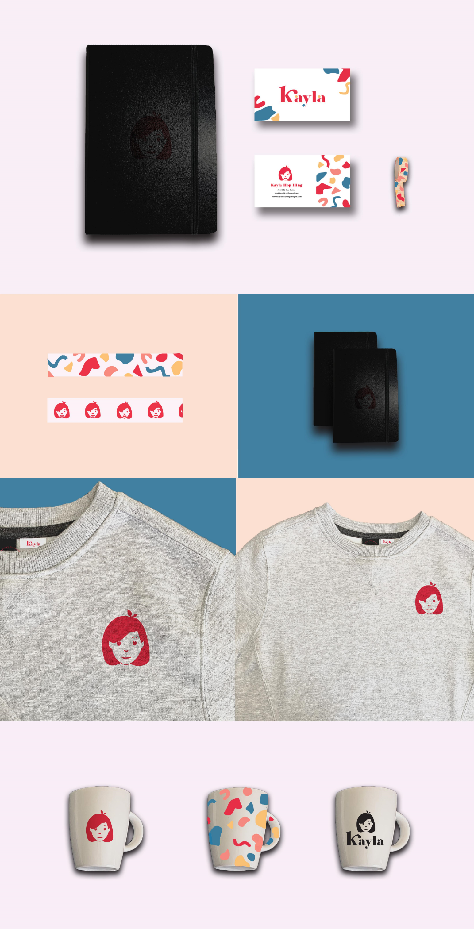
Design of business card for client including front and back design with added visual elements.
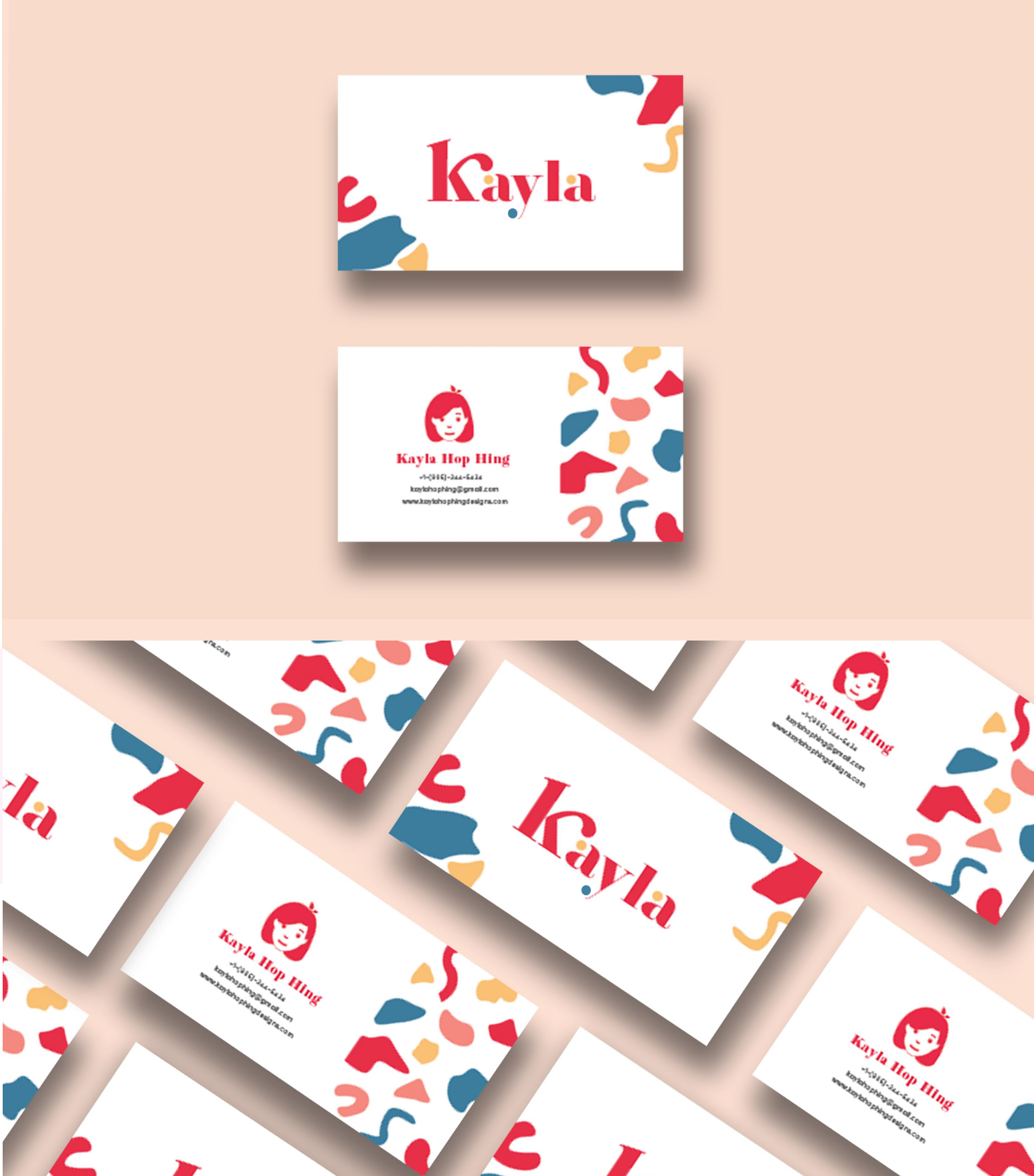
Mockups created to demonstrate use of logo in various settings.